This Guppy Multiple Moving Average (GMMA) indicator tool is based on the relationships between groups of moving averages. Each group of averages in the GMMA provides insight into the behavior of the two dominant groups in the market – traders and investors.
The indicator itself does not initiate an entry or an exit. It allows the trader to understand the market relationships shown in the chart and so select the most appropriate trading methodology and the best tools. The GMMA is designed to understand the nature of trend activity. If there is no trend, then the tool cannot be usefully applied. Traders should not attempt to make it work in conditions to which it is unsuited.
The indicator was first discussed in Market Trading Tactics and in more detail in Trend Trading (April 04 release), by Daryl Guppy. It is also demonstrated in case study examples in the weekly Tutorials in Applied Technical Analysis newsletter.
We track the trader’s inferred activity by using a group of short term moving averages. The traders always lead the change in trend. Their buying pushes up prices in anticipation of a trend change. The trend survives only if other buyers also come into the market. Strong trends are supported by long term investors. The investor takes more time to recognize the change in a trend but he always follows the lead set by traders. We track the investors’ inferred activity by using a group of long term moving averages.
The GMMA is used in six trading situations
- Classic trend breaks
- Join the trend
- Using price weakness
- Rally and trend break
- Better exits
- Bubble trading
A brief example of each is included in these notes.
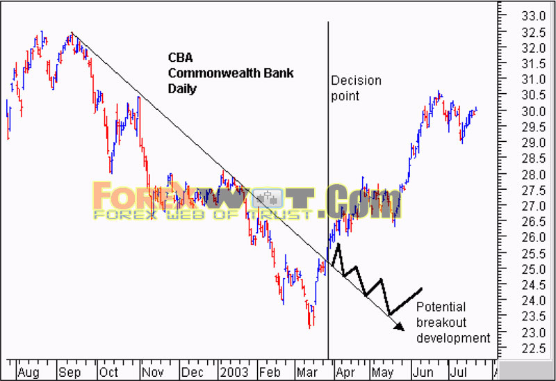
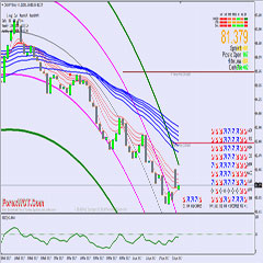
The Commonwealth bank (CBA) chart shows the classic application of the GMMA. We start with the breakout above the straight edge trend line. The vertical line shows the decis ion point on the day of the breakout. We need to be sure this breakout is for real and likely to continue upwards. After several months in a downtrend the initial breakout sometimes fails and develops as shown by the thick black line.
The GMMA is used to assess the probability the trend break shown by the straight edge trend line is genuine. We start by observing the activity of the short term group. This tells us what traders are thinking. In area A we see a compression of the averages. This suggests traders have reached an agreement on price and value. The only way to take advantage of this ‘cheap’ price is to buy stock. Unfortunately many other short term traders have reached the same conclusion. Traders who believe they are missing out on the opportunity outbid their competitors to ensure they get a position in the stock at favorable prices.

The compression of these averages shows agreement about price and value. The expansion of the group shows traders are excited about future prospects of increased value even though prices are still rising. These traders buy in anticipation of a trend change. They are probing for a trend change. We want confirmation the long term investors are also buying this confidence.
The long term group of averages at the decision point shows signs of compression and the beginning of a change in direction. Notice how quickly the compression starts and the decisive change in direction. This is despite the longest average of 60 days which we would normally expect to lag well behind any trend change. This compression and change in direction tells us the re is an increased probability the change in trend direction is for real and sustainable. This encourages us to buy the stock soon after the decision point shown.
This compression and eventual crossover within the long term group takes place in area B. The trend change is confirmed. The agreement amongst investors about price and value cannot last because where there is agreement some people see opportunity. Many investors missed out on joining the trend change prior to area B and now the change is confirmed, they want to get part of the action. Generally investors move larger funds than traders so their activity in the market has a larger impact.
More Moving Averages Trading Systems
- Trading Forex MA Multifilter System With Currency Rates Comparison Chart
- Forex Trend Catcher Trading Strategy With Moving Average and MACD Custom Indicator
- Forex Vortex Moving Average Trading Strategy With Custom MACD Indicator
- High Profitable Forex Strategy With EMA Momentum Trend Trading System
The latecomers can only buy stock if they outbid their competitors. The stronger the initial trend, the more pressure to get an early position. This increased bidding supports the trend and is shown by the way the long term group continues to move up, and by the way the long term group of averages separates. The wider the spread the more powerful the underlying trend.
Even traders retain faith in this trend change. The sell-off in area C is not very strong. The group of short term averages dips towards the long term group and then bounces away quickly. The long term group of averages shows investors take this opportunity to buy stock at temporarily weakened prices. Although the long term group falters at this point, the degree of separation remains relatively constant, confirming the strength of the emerging trend.
The GMMA identifies a significant change in the market’s opinion about CBA. The compression of the short term and long term groups validates the trend break signal generated by a close above the straight edge trend line. Using this basic application of the GMMA, the trader has the confidence necessary to buy CBA at, or just after the decision points shown on the chart extract.
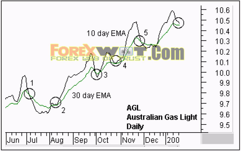
Is it a good idea to buy into a trend on the basis of the price weakness..? The GMMA provides a more comprehensive answer and an analysis of a chart using just two moving averages shows why. The Australian Gas Light ( AGL) chart shows a 10 day and 30 day exponential moving average. We have no way of telling if the current retreat in prices is temporary, as it has been in areas 2 through 5, or if it is part of a larger trend dip as in area 1. The most we infer from these relationships is that this combination of moving averages delivers many false signals.
The GMMA indicator provides us with a greater depth of information. We examine three features at the vertical line decision point:
- The degree of separation and compression in the long term group of averages.
- The degree of separation and compression in the short term group.
- The degree of separation between the groups.
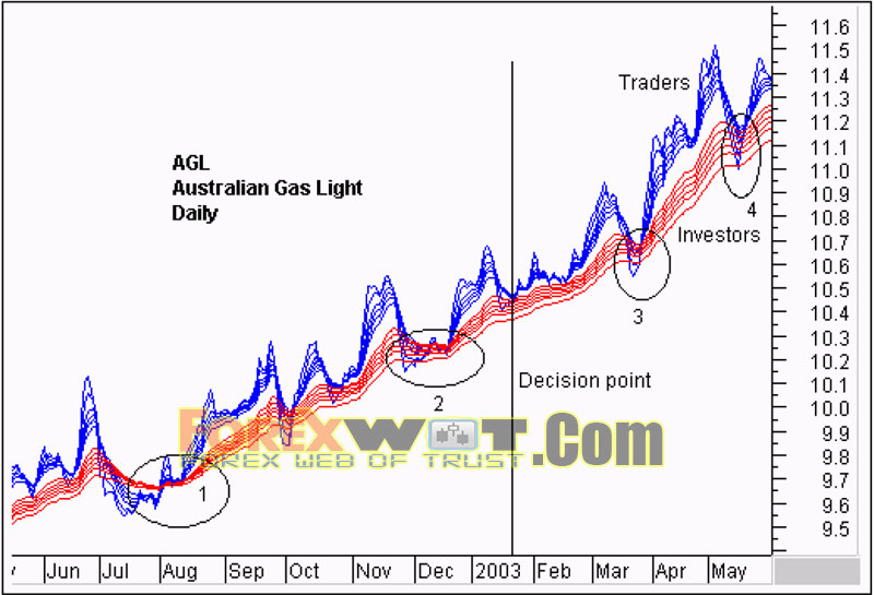
We start with investors. This is a nervous trend. The separation of the long term group of averages is relatively narrow. After the resumption of the trend in area 1 the stock has not enjoyed dedicated and committed investor support. The long term group of averages has not separated strongly and this narrowness makes this trend more vulnerable to attack and decline.
When prices are driven down we see nervous investors taking the opportunity to sell rather than buy. This is shown by the way the long term group of averages compress and this comes from selling activity as investors off- load stock to lock in a better match between price and value.
There is regular compression and expansion activity so traders are active in this stock. Traders push prices up, take short term profits, and then watch how the market behaves as prices are driven down. This frequent rally and retreat activity suggests traders believe the trend is not well established. They are worried about the trend collapsing which is why they take the short term profits. The collapse of prices probes the strength of the trend.
Each pull back weakens the trend. In area two it causes a compression of the long term group. The traders’ rebound is slow to develop. In area three the short term group dips below the long term group before rebounding. This happens again in area four and each larger and stronger dip confirms a slowing of the trend and increases the probability of trend collapse. In June the trend reverses, dropping from a high of $11.50 to below $10.60.
On this chart there is no pattern of consistent separation and this confirms the relatively unstable trend. This information allows us to make a better decision. For traders the GMMA confirms there are short term trading opportunities. These trades call for speed, caution and discipline.
For investors the GMMA suggests joining this trend for an extended period carries higher risk. The more often a trend is probed for weakness by falling prices, the greater the potential, for a trend collapse. This trend has the potential to collapse quickly.
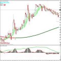
We all know this feeling when during a search of the market we stumble across a stock like Timbercorp (TIM). We want to join this trend as prices drop back towards the straight edge trend line. We have three questions to answer.
- Is the underlying trend strong?
- Is this price collapse temporary, or the start of a new downtrend?
- How can I enter at the lowest possible price just prior to a rebound?
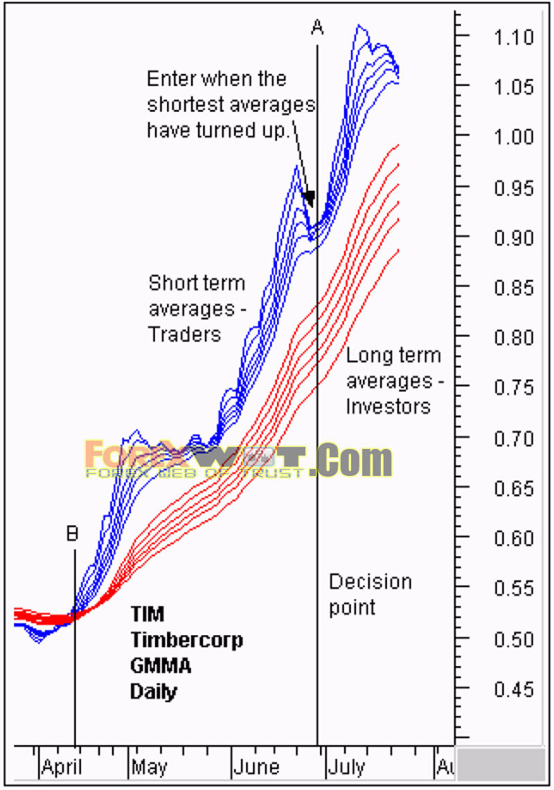
The GMMA display provides the trader with more information. The decision point is shown by the vertical line A. The key to any trading decision is the strength of the underlying trend. The long term group of averages is well separated, moving upwards, and moving in a broadly parallel fashion. This has all the characteristics of a strong trend. This conclusion helps to answer the second question.
The price retreat is unlikely to be the start of a new downtrend. If this price fall was a serious threat to the trend we would see the long term averages beginning to compress. This is not happening and supports our conclusion the underlying long term trend is sound.
Close observation of the behavior of the shortest of the short term averages helps to make a more consistent decision about early rebound entries. We know the underlying trend is strong, so we concentrate on the behavior of the 3, 5 and 8 day averages in this grouping. Once they all begin to reverse we buy at the best possible price in anticipation of the rebound continuing. Even if we miss this point by several days, our understanding of the nature and character of the trend gives us the confidence to pay slightly higher prices to join.
Aggressive traders look for early signals of a trend breakout because an early entry provides the key to substantial profits as the trend develops in future weeks and months. Understanding the difference between a rally and a trend change allows the trader to establish a better trading plan and to apply the most appropriate trading tool. This is particularly important in the context of a prevailing downtrend because it prevents us from mistaking a rally for a true breakout.
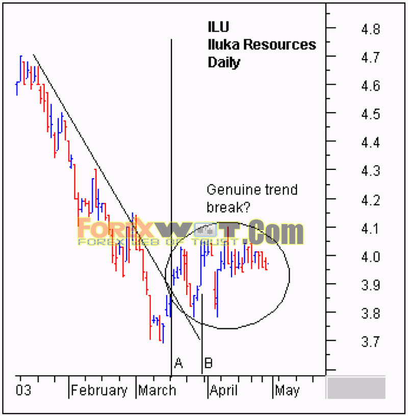
The bar chart display of Iluka Resources (ILU) sets out the main decision points. The break above the straight edge trend line is shown by the vertical line on both this and the GMMA chart. This is a relatively slow trend change and is more characteristic of market behavior than a rapid “V-shaped’ rebound. Price moves above the trend line, and then move sideways with a slight upwards bias for the next few weeks.
There is plenty of time to make a decision here before prices move to new $4.40 highs in a strong up trend. From March through May traders reasonably ask: “Is this a new trend break…?” If the answer is yes then they concentrate on getting the best possible entry price around $3.80, buying these lows with confidence. If the answer is uncertain, they may be forced to join the trend at around $4.30 as the trend break is dramatically confirmed a few days later. The best analysis puts money in our pockets.

We start with compression analysis at the point of the breakout, shown by the vertical line A. The long term group is well separated; suggesting any price rise is likely to be capped. This calls for caution. Although we now know this trend line break was accurate we could not make this decision with confidence at the time.
Entering ILU at point A was a gamble. Line B points towards a shift in the balance of probabilities. The long term group has begun to compress in reaction to the rally behavior of the short term group. The thick line shows the degree of separation at line A. Compression tells us investors are buying and expansion tells us they are selling. At line B the long term group has compressed, revealing investors are beginning to compete with traders to buy ILU as price rises.
A few days later, the rally is capped, and prices decline. We compare the level of penetration in two ways. We first note the second rally succeeded in penetrating the long term group of moving averages. The first rally did not achieve this. Second, we note the roof of the second rally is higher than the first. The peaks in the short term group of averages are rising, suggesting increasing strength. At the peak of the second rally the long term group of averages is compressed quite noticeably. Investors are now buyers, starting to compete amongst themselves to get hold of stock. This is a bullish signal.
Confirmation comes with pullback analysis. First the pullback in area 1 is lower than the pullback in area 2. Traders are not prepared to let price fall as far as it did previously. In March many thought $3.85 was a good entry point but by early April many traders think $3.92 is a good entry point. We know this because the traders come into the market at this level, buying stock and preventing it from falling any further. Investors who are interested in selling stock do not have to drop their offer price any lower as traders will buy ILU at $3.92.
The nature of the pullback at point 1 is different from point 2. In the second pullback and rebound, the compression area of agreement develops rapidly and quickly moves up as the short term group of averages separate. This is active trading and this sequence of higher rallies and lower pullbacks in the short term group of averages sets the conditions for an early entry into a high probability trend break.
The trader and the investor have a clear analysis path confirming this is a new trend break and not just a short lived rally.
Many trends roll over slowly making it is easy to convince ourselves the trend is pausing rather than changing. These slow collapses give us plenty of time to fine tune an exit, but only if we recognize the beginning of a trend change.
The key relationship signaling a trend change is the behavior of traders. Each new bounce away from the long term group is weaker. When prices move up, traders who have not sold their previous positions swamp the market with sell orders so any rally is very short- lived. Desperate to get out, traders keep offering stock at lower prices as the rally retreats. As a result the short term group of averages dips even further into the long term group. The next rebound is weaker, and the retreat more severe.
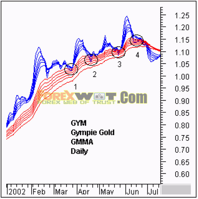
The Gympie Gold (GYM) chart in tracks this behavior over several months. The retreat and penetration in area three is much greater than in area one. It is the reluctance of the long term group to act as buyers which suggests a weakening of the trend.
In a strong trend, the ability of the short term group to threaten the trend is countered as aggressive investors buy the stock as price falls. Deeper penetration by the short term group shows investors are losing interest. The final rebound in area four is a complete failure. When increasing penetration is combined with compression in the longer group of averages the warning of a trend change is loud and clear. This compression shows agreement on value. Investors also believe the stock is fully valued so when prices dip investors are no longer buyers. When prices lift the investors join traders as sellers and results in compression in the long term group.
In established uptrends, prices bubble above the trend and in over heated markets these bubbles extend well above the long term trend line. Bubble trading is a speculative activity. It calls for good trading skills and excellent trading discipline. The objective is to ride the momentum driven bubble for as long as possible. Exits are fine tuned using a variety of volatility-based indicators and techniques. The end-of-day chart sets the general scene for the exit, but the actual exit is best managed using intraday trading tools. Many traders avoid speculative bubble trading because it is so demanding.
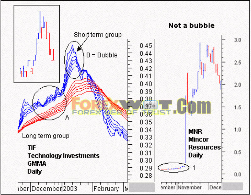
The Technology Investments (TIF) chart shows the essential characteristic of a bubble. This is not a subtle chart development and most times it is very clear on the bar chart, as shown in the extract. What makes this a bubble is the change in the nature of the trend. This is not an accelerating, or fast moving trend. A bubble occurs in an established trend. It represents the final burst of speculative activity based on a developed trend. Just like a bubbling pot of soup, this price bubble lifts above the surface, bursts, and then collapses back to the surface.
The bubble should not be confused with the price action shown with Mincor Resources (MCR). This is a dramatic and sudden change in price activity. This is a momentum driven trade from beginning to end. This isnot a bubble on an existing trend. The ‘bubble’ is the trend. When it collapses, or develops into a more stable trend, the starting point is well above the original trend or surface in area one.
Price activity, and GMMA relationships, are different in the bubble. The trend in area A shows a steady and consistent degree of separation between the long term and short term groups of moving averages while area B shows a substantial widening of this gap. Prices shoot well above what investors are prepared to pay.
The trading activity of expansion and compression is not dramatic in area A. In area B, the expansion of the short term group is significantly greater than in area A. The steepness of the slope increases, and the degree of separation within the short term group also increases dramatically. The wider the spacing in this group the greater the level of overexcited competition amongst traders. They aggressively outbid each other to get stock. This simply cannot last for long because it calls for new money to buy at ever increasing prices. When traders try to lock in profits they do so aggressively. This means meeting the offer and the result is a sudden tumble in the short term averages, which leads to a cascade of lower offers. Prices collapse as the bubble is pricked.
The GMMA allows the trader to understand the nature and character of the trend. Armed with this knowledge we select the most effective trading tools for each situation.
 Consistently Profitable Forex Multi Trend Channel Trading With GMMA Center of Gravity Bands Indicator
 Forex Multiple Moving Average : Discover How to Make 600 Pips a Month Consistently
 TOP 10 Best Bollinger Bands Forex Trading System and Strategy
 The 10 Best Forex Currency Trading Systems & Strategy That Are Guaranteed To Work
 The Essence of Moving Averages: What Every Successful Forex Trader Should Know
 FREE DOWNLOAD 20+ Best Forex MACD-Moving Average Trading System
 Very Simple Effective Forex BBwin MACD Trading System with Moving Average and Heiken Ashi Indicators
 Top 10 Forex ADX Trading System (High Accuracy ADX System)
 High Profits Forex Three Fast Moving Averages Bullish Bearish Trading System and Strategy (MA)
 Simple Techniques How to Measure FOREX Market Sentiment
